Hey,
>>> sajolida:
>>> #8968: Redesign the "language" section
>>>
>>> I like the simpler way of displaying all the language options one of
>>> top of each other as this would solve #8968.
>>>
>
> Alan:
> We should also keep in mind that language selection must be
> discoverable by people that might not understand a single word of
> english. It was among the goals of the list of languages on the left of
> the languages section: seeing different languages names that you
> probably know some invite you to click on yours first. I like the
> aesthetics of your proposal but I'm afraid it might not address this.
>
Thanks, but keep in mind that these are just high-fi wireframes, so
there is plenty of room for visual treatment. The form is directly
influenced by the info.
I see the value in experiential recognition, however, this is a one-time
use case, though it is arguably the most important one. Maybe there is
an auto-prompted walkthrough the first time Tails is run [if this isn't
a security issue]. Even if people choose not to save settings, for
whatever reason, they would now know that this section, even if in an
unfamiliar language, is for adjusting the language. This wont work so
well for a hand-me-down version of Tails-on-a-stick, though.
Or, though it could become annoying, even though it could maybe be
deactivated somewhere in the settings, what if there is an always-on
alert/walkthrough instruction to edit the language, or even the other
settings. This could be a resolution for the guided configuration flow,
too, where it just runs on startup until deactivated [and it can always
be turned back on].
We could also do something super simple, like this[0], though that might
be too simple as well as bare the burden of a click, and ultimately,
more flow fragmentation.
>>>
>>> Still, I would have those
>>> options directly editable (without having to click "Edit"). You might
>>> have argued in favor of that choice later in the thread, though.
>>
>> Spencer:
>> Direct editability would be most appropriate if all of the options
>> were
>> visible, including the more technical options, then there would be no
>> fragmentation of the configuration flow.
>>
>
> I really think we should go this way: direct editability; less
> fragmentation.
>
I agree, but it makes the most sense if we have all of the options on
this first screen. However, the issues with this "all-in-one"
experience are:
- Possible information overload
- Saving the more technical settings = security issues
- Available space
A complete IA outline is necessary to effectively determine the impact
of the first and third issues, with a mockup/flow study, or two, being
needed to determine the impact of the second issue.
>>
>> However, I understand and
>> respect the desire to accommodate different use cases and the varying
>> technical understanding of people by having two separate configuration
>> flows. Having two paths requires a decision, though, and an 'Edit'
>> button is an effective way of addressing this.
>>
>
> I really don't think the edit button to be appropriate for the
> "Language" section. Why not for the "Advanced" one if we find no better
> way.
>
An 'Advanced' button is interesting, but we would also need a button to
enter the guided configuration flow, and the 'Edit' button with two path
choices addresses this in an effective manner, even if only the language
options are displayed - though 'Edit' would need a more effective label,
and then doesn't make as much sense as the questions then become "Would
you like to configure some other settings than are displayed here?" and
"Which of these two paths would you like to take to configure the other
settings that are not displayed here, the "guided" or the "non-guided"
path?"
If we have the language section separate from the two configuration
flows, we have the same architectural structure we are exploring away
from. Maybe, to cut down on the fragmentation, we have a directly
editable language section that has an expandable advanced section below
it, and, if the arrow or plus sign is actioned to display the advanced
settings, the section, in addition to the more technical settings, also
reveals a button to enter the guided configuration flow - or maybe this
is simply a link and is always displayed.
Visually, the configuration story is:
- A display of the 'Default' or 'Saved' settings appear on a sign at the
nexus of a three-way fork in the road, each path is different but all
lead to the same destination. One is the shortest in length and is a
direct path to the destination, one is medium in length and eventually
leads to the destination, and one is the longest in length but has a
guide to walk people through it. *The difficulty/value of each path is
left out due to subjective variance.
What we need to decide is which is the most appropriate way of
discovering, or being informed of, these paths, as that would inform the
structure.
I think the shortest path should always be displayed, unless maybe
during the guided configuration flow, or even during both configuration
flows, if we keep them separate from the language settings flow and
don't just allow direct editing of even the more technical settings on
the first screen.
The medium length path is a highly reoccurring use case, especially
given that people might not be saving the more technical settings and
will always be having to edit them.
The longest path, the one with the guide, should either be opt-in or
opt-out. Opt-in is when people choose to take this path, as it is
always displayed as an option. Opt-out is when this path is taken every
time until people decide that they no longer want to take it. This
might not be the entire flow that happens, but maybe just an alert to
the option of that flow.
>>>
>>> A solution to both problems could be to rely on "tabs" or "views" as
>>> we
>>> proposed with Alan on
>>> https://labs.riseup.net/code/attachments/download/652/greeter2.png.
>>
>> I am not a fan of tabs, though that could address space issues.
>>
>
> Why? Please convince me!
>
The most common interfaces that I see in our context are:
Columns[1]
and
Tabs[2]
My issue with these are that they clutter the experience with
unnecessary frames, physically and mentally. Both hide information and
weaken user trust, as people often have to double check the status of
things; with security, this can become a problem.
>>
>> Having
>> an expandable 'Advanced' section below the language settings feels
>> more
>> appropriate and less fragmented.
>>
> Tchou already proposed this, and I was not convinced because I didn't
> see other examples of such an expandable section in GNOME. But seeing
> you also propose it, I'm up for being convinced: if two different
> persons think it's the solution, let's explore it anyway...
>
Unless you are referring to something else [please direct me if you
are], tchou proposed an accordion interface; this is not what I am
thinking, at least not visually.
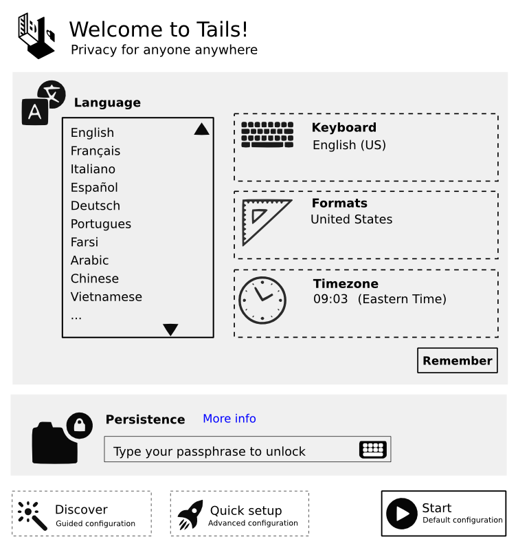
This[3] is what I am thinking. We keep the language settings fixed and
directly editable.
How fixed is the vertical height of the greeter window?
We could also do an initiation where, unless there are arguments against
it, people are invited to enter into a more advanced experience, like
activating 'Developer Options' on Android/Cyanogen, with the setting up
of the administration password/encryption.
>>>
>>> Still, I'm conscious that this might be antagonist to the idea of
>>> #8974
>>> (Feedback to the user which options are going to be used). But then
>>> maybe we don't have to push that information to the user if she
>>> doesn't
>>> diverge from the default settings.
>>>
>
> What about displaying which advanced options are checked on the 1st
> screen only when they diverge from defaults then? It would address
> #8974 (Feedback to the user which options are going to be used) without
> confusing newcomers or less technical users.
>
This makes sense. With this approach, people could learn something that
they actively pursued, since a persona could be sculpted that never
wants to be forced to learn something they didn't pursue.
What if this was a choice to display certain settings? Though, in
addition to complicating the structural flows, this could add too much
to the options.
>>
>> I firmly believe that designers, which we all are, are teaching others
>> how to learn by creating interfaces that allow people to teach
>> themselves.
>>
>
> I like this idea but *disclaimer*: I'm not a designer, I'm a GUI
> programmer that try to take UX design into account.
>
Yes, and I respect your desire to disclaim the label of "Designer",
however, unless you are simply implementing decisions made by others,
you are a designer, as design is to designate. Though, if you
absolutely reject that title, no worries.
>>
>> With this said, it seems appropriate to educate people of
>> varying technical levels of understanding what options are available
>> to
>> them and what importance these options hold in regard to the intended
>> function.
>>
>> In our situation, this is most effectively accomplished by
>> displaying everything upfront
>>
>
> I'm not sure. Displaying everything upfront has:
>
> Pros:
>
> - more discoverability
> - easier access to all options
>
> Cons:
>
> - more information to be processed by (new) user
> - risk of trying potentially harmful options easily without reading
> the doc/searching for the option (this can be addressed by
> warnings/strings while editing such options but should be thought!)
>
I think the display of technical settings upon request after editing
them, or by revealing them at the click of an arrow underneath the
language settings both address all of these.
>>>
>>> #9004: Reword the "remember" options for language settings
>>>
>>> I'm worried by the fact that you placed the "Save" button below all
>>> the
>>> other settings. The idea here is the allow for saving the language
>>> options only (as all the other ones might have privacy implications).
>>> Remember that our last consensus had it as part of the "Language"
>>> section. See
>>> https://tails.boum.org/blueprint/greeter_revamp_UI/greeter-1st-screen.png.
>>> But still, apparently this has to be improved upon, so let's keep
>>> this
>>> in mind.
>>>
>>
>> Can you expand upon the privacy implications of saving all other
>> settings for future sessions, or point to a thread that already has?
>
> - Whatever the content of the option is, saving an option saves
> information on the user the device (key) belongs to. If I'm an
> adversary that gets a Tails device in Italy, having an italian
> language set doesn't give me much information as it's likely most
> Tails in Italy have it. On the other hand, any other option saved on
> the clear further reduces the anonymity set of the user.
> - some settings, like saving Tor bridges (unencrypted) gives
> information that highly reduces the anonymity of the user in an
> adversary gets the device
>
I look at editing the settings of a device that I own as an
administrative task. Couldn't this be addressed with the protection of
an administrative password that decrypts the settings?
>>
>> What are the specific issues and how do they differ from those
>> presumably
>> present with saving language settings and having encrypted storage?
>
> We need to store language settings unencrypted because they are
> required to type the passphrase to unlock the encrypted storage (if
> present). All the other options we might want to save can be saved
> encrypted in this storage because we don't need them before unlocking
> the storage.
>
Same thought as above, with the addition of the thought that maybe we
can still display a version of the language settings even though they
are encrypted behind the administrative barrier. Maybe all settings can
be spoofed and delivered unencrypted, with an option being not to
display anything but the administrative password field.
>>>
>>> #8244: Decide if we want to keep the wording "Quick setup"
>>>
After thinking more about it, just addressing the label 'Quick Setup',
it should be, at least in discussions, labeled 'Guided Configuration',
since you guys see the language settings as "basic" and the more
technical settings as "advanced". Guided and non-guided are clear
opposites and are best used to describe the two configuration flows.
Basic and advanced are clear opposites, even if, as an alternative to
describing the difficulty levels of the configuration flows, they are
used to describe the two levels of configuration settings - less
technical and more technical.
The simple version of 'Guided' and 'Non-guided' configuration flows, for
me, was 'Basic' and 'Advanced', with 'Basic' appearing with the word
'Walkthrough' like shown here[3].
>>>
>>> #8776: Rename "Start" button as "Start Tails"
>>>
>>> I see that you are in favor of "Start Tails". I'm all for it as well.
>>>
>>
>> Start Tails :) Though I understand and respect the use of icons for
>> the
>> sections, such as 'Language', I would push for no iconography for
>> 'Start
>> Tails'. What do you all think?
>>
>
> OK for me.
>
> I'm glad to see we start to understand each other better, and to
> converge towards a solution!
>
Yay for resolutions!!
Wordlife,
Spencer
[0] First Attachment
[1] Second Attachment
[2] Third Attachment
[3] Fourth Attachment


