Hey hey hey,
>
> sajolida:
> First of all, I owe you a disclaimer. I've been partly on holidays.
>
Welcome back!
>
> Then, I must say that I'm impressed by the quantity of work and ideas
> that you put into this! I really appreciate having several options to
> compare visually. Especially since their visual quality make it very
> easy to treat them as if they were real interfaces. Much more than the
> stuff we came up with until now and I think that this brings more
> quality to our discussions.
>
Thanks. I fucking love Tails, so I thought I should give back. Since
we are noting things, and this goes for everybody, feel free to request
visualizations of anything relating to Tails, even your work/thoughts.
>
> I also feel
> like we're working on quicksands and we still do not agree on some
> fundamental ideas behind this work.
>
> So here I comment on more abstract
> concepts that I felt we badly transmitted.
>
> My main concern is #8976 [Consider merging "basic" and
> "advanced" screens]. Let me recall a bit of history. Back in the happy
> days of the last design that was consensual between Alan, tchou, me,
> and more people, the language and persistence settings (let's
> called them "basic settings") were the same for everybody and then
> people needing extra configuration had to choose between "guided
> configuration" and "advanced configuration".
>
>   - "Advanced configuration" would make the settings explicit and
>     allow people to change them one by one. That's "feature-driven".
>
>   - "Guided configuration" would ask the user some question about her
>     context and needs and would deduce from that which settings to
>     apply. That's "context-driven".
>
Yes, but that "Guided Configuration" flow[0] contained an option to
configure encrypted storage, which seemed redundant, either in this
second location, or in the first location[1], and seemed most
appropriate on the first screen for everybody (or only in each of the
two flows, one where you are "Guided", and the other where you are not).
It also seemed appropriate to mirror the "UnGuided Configuration"
settings in the "Guided Configuration" flow by including the 'Language'
section. The 'Language' de-emphasis case was made here[2].
To better understand the flow paths this table was created.
The paths are (C=Configuration & S=Start Tails & X=Impossible):
                Guided C   UnGuided C     No C
               ---------- ------------ ----------
S w/Default C |    X    |     X      |         |
               ---------- ------------ ----------
S w/Saved C   |         |            |    X    |
               ---------- ------------ ----------
S w/Unsaved C |         |            |    X    |
               ---------- ------------ ----------
But, after reading what you wrote, we could do 'Configure by Context'
and 'Configure by Settings' as labels, replacing 'Context' with 'Use
Case' or 'Attack/Threat Model', or something, though this probably
overlaps other discussions/existing decisions about wording.
However, 'Configure Context' and 'Configure Settings' (different than
Configure by Context and Configure by Settings) could be hierarchically
ordered siblings that walk *everybody* through selecting a context,
then, if Default settings isn't preferred, settings can be further
configured and would still serve the 'Check & Go' function for both
end-of-the-spectrum use cases. But this is a new thought based on your
thoughts above, so it would have to be visualized to effectively work
through the thought problem.
>
>     Note here that we are not talking about a "tour" as in
>     http://tour.ubuntu.com/en/ but about a configuration assistant.
>
Why not? This action bar is super clear (with 'Language' toggle being
replaced with 'Restart' Tails button). On
http://tour.ubuntu.com/en/
there is the established context that the user is investigating Ubuntu
as a whole; Tails could do this on the website, too. However, in the
Greeter, there is the established context that the user is in a
pre-tails state where the only options are to accept (Start Tails),
decline (Restart Tails), or edit the settings; the presence of the
'Start Tails' button establishes this. So it seems to follow that
using 'Tour' as a label for the Guided/Assisted/Contextualized
Configuration flow is suitable, especially since what is happening when
you are being guided though something you are unfamiliar with is being
given a tour. But please make suggestions, the more the merrier :)
Though it sounds like the reservation is with the label terminology, I
will still say that the universality of the Ubuntu Tour Action Bar
Interface speaks of its effectiveness, such as an Enter/Exit sign combo,
and should seriously be considered as a structural option for the
choices users will have to make.
>
> Some months later, based on the feedback from the UX experts from
> NUMA, tchou proposed to merge both the "basic settings" and the
> "advanced settings" on the same screen with accordions **while not
> displaying them by default**. This rose some controversy because it
> used widgets that don't exist in GNOME.
>
> Shortly afterwards we started an interesting discussion to try to
> isolate the problem behind #8976:
>
> https://mailman.boum.org/pipermail/tails-ux/2015-March/000309.html
>
> Please have a good read at it again as many good arguments were give
> there already. Long story short, at least intrigeri, Alan, and me
> expressed themselves against displaying all options by default on the
> first screen. I understand that tchou's position is similar since he
> was still hiding them with his accordion.
>
True, and in addition to the objection to displaying all options by
default on the first screen, objections were made to hiding all options
with accordions/disclosures/expanding dialogs/scroll-bars and to forking
users into each respective flow with an 'Edit' button.
The matrix is this (D=Dialog):
         Display    Hide
        --------- ---------
Same D |        |        |
        --------- ---------
Diff D |        |        |
        --------- ---------
Prior to[3], all options had been objected to. Given the need to align
with the UI functionality of GNOME, and that available vertical space
will be an issue with the all-in-one dialog structure, the 'Edit' button
seems to be the most suitable option. This is the 'Hide + Different
Dialog' cell in the table (where my Game Theory heads at!). Though the
Action Bar seems most suitable if it contains a left-justified 'Restart'
button and a right justified pair of flow path buttons. We can choose
from the two buttons being links to "Guided Configuration" and "Tails
Desktop" or being links to "Guided Configuration" and "UnGuided
Configuration", though, with this latter one, we have just introduced an
entire click for the most occurrent "UnGuided" user to accommodate for
the least occurrent "Guided" user.
>
> To me, no strong enough evidence against this collective stand was
> raised in this thread.
>
No worries, though we did walk through these thoughts here[4] where the
Pros outweighed the Cons, here[5] where we felt that the all-in-one
screen accommodated for pop overs (direct editability) while we also
acknowledged the Cons, and here[6] where we started agreeing that the
only real option left was display all settings options on default, since
logic[2] and preference requests removed the collapsing options and
added them to the discard pile alongside the tabs options and the
columns options.
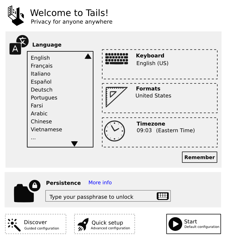
The 'Check & Go' dialog[0] from the "Guided Configuration" flow displays
all of these options, so why not display all of these options on the
same 'Check & Go' dialog in its new location as the first screen.
In short, display all settings options on default is the only option
left - though this can be on a second screen.
>
> And I'm thus surprised to see that this was not
> taken into account by these designs: all options are displayed upfront
> by default.
>
> I think that core problem that we need to solve here is to find the
> technical means of doing this: having these options available but not
> displayed by default.
>
> The two different paths were maybe to right,
> the accordion was maybe not realistic, but we also tried views and
> tabs.
>
It is unclear what is meant by "Views", it's just another way of
referring to "Tabs", yeah?.
Both Columns and Tabs clutter the experience with unnecessary frames,
physically and mentally. Both hide information and weaken user trust,
as people often have to double, even triple check the status of things;
with security, this can become a problem.
Accordion functionality lessens this clutter but has the same "hidden"
info/trust problems.
>
> We need to get back to this discussion and find solutions to this
> problem that takes into accounts all the arguments that were provided
> already and works with the GNOME toolkit.
>
I see this as the discussion, the images are just tools to help with
visualization. It is my understanding that Alan is assembling a master
designations document and requesting feedback, we might be more
effective at decisions there, maybe we can use some sort of consensus
software[7] :)
>
> But once we have this, I'm very confident that we can continue
> building up on the more detailed work that you have been doing so far
> as it's great and then the final result will be rock solid!
>
Yay!
>
> Also keep in mind that **none** of these mockups were tested with
> users yet. We talked about them amongst ourselves, we reviewed it with
> experts, etc. but we never sat with regular users and watch them
> interact with those.
>
Will do.
>
> My personal take on this is that we should take it easy, come up with
> something that's simple, classic, as little controversial as possible,
> and easy to implement. Then test it and see how it does. I would also
> be in favor of testing stuff on paper first but I feel like Alan is
> dying to type some code; which is great!
>
Sounds good!
I don't know if any of the above resolves the main issue of *how* we are
going to hide these options by default; I think I might have even
introduced more problems.
However, in an attempt to reach a resolution, I think that Alan's
proposal to display the more technical settings *only* after user
request seems appropriate, though there are some issues. For the
"Guided" user, the option to activate the display of settings would come
at the end of the tour. For the "UnGuided" user the option to activate
the display of settings would come at the end of configuring settings.
The issues are that for the "UnGuided" user the first screen isn't the
one they want because it is un or not fully editable, so they click to
the editable page. This conflicts with the request to preserve
"one-click access". Also, it is difficult to visualize the "UnGuided"
user as she moves from not having settings displayed on the first
screen, to being able to edit them, to being able to activate the
display of settings from this point on on the first screen. A hole in
the barrel, if I may. And then there is the added setting, one to
activate settings, even, and we should avoid "add[ing] extra settings
that would split the anonymity set, need documentation, and so on.
I think it needs established what each "Guided" users use case is
regarding "learning".
Do they:
- Intend on using the "Guided Configuration" until they can use the
"UnGuided Configuration".
- Intend on using the "Guided Configuration" forever.
I also think it needs better established what the use case occurrence is
in a users lifetime.
Is it:
- Least Occurrent - Start Tails after "Guided Configuration"
- Commonly Occurrent - Start Tails after "UnGuided Configuration"
- Most Occurrent - Start Tails with Default or Saved configuration
settings
And maybe what "we" think the life-span of using "Guided Configuration"
outside of having it as an anytime reference.
The difficulty with following this thread: Me
As words increase so does content lossyness, and I broke the thread
multiple times.
Wordlife,
Spencer
[0]:
https://tails.boum.org/blueprint/greeter_revamp_UI/NUMA_flow/
[1]:
https://tails.boum.org/blueprint/greeter_revamp_UI/greeter-1st-screen.png
[2]:
https://mailman.boum.org/pipermail/tails-ux/2015-June/000437.html
[3]:
https://mailman.boum.org/pipermail/tails-ux/2015-July/000507.html
[4]:
https://mailman.boum.org/pipermail/tails-ux/2015-March/000346.html
[5]:
https://mailman.boum.org/pipermail/tails-ux/2015-March/000350.html
[6]:
https://mailman.boum.org/pipermail/tails-ux/2015-May/000383.html
[7]:
http://news.microsoft.com/features/tossup-make-plans-the-hassle-free-way-with-new-microsoft-garage-app/


