Hi,
First of all, I owe you a disclaimer. I've been partly on holidays
since you started this thread, now I'm back on tracks but it took me a
while to find the time to go through it. It was an hour of reading!
Then, I must say that I'm impressed by the quantity of work and ideas
that you put into this! I really appreciate having several options to
compare visually. Especially since their visual quality make it very
easy to treat them as if they were real interfaces. Much more than the
stuff we came up with until now and I think that this brings more
quality to our discussions.
Spencerone, how do you do that? I guess we have something to learn
from you here :)
Then, to explain a bit more my emotional state when dealing with the
Greeter, I must say that it's always a big effort to jump back in the
discussion. It's quite hard for me to follow this by email, especially
with big delays and partial discussions in the middle. I also feel
like we're working on quicksands and we still not agree on some
fundamentals ideas behind this work.
So here I won't comment much on the "implementation details", the
layout or the look-and-feel of the drawing, but on more abstract
concepts that I felt we badly transmitted.
My main concern here is about #8976 [Consider merging "basic" and
"advanced" screens]. Let me recall a bit of history. Back in the happy
days of the last design that was consensual between Alan, tchou, me,
and more people [1], the language and persistence settings (let's
called them "basic settings") were the same for everybody and then
people needing extra configuration had to choose between "guided
configuration" and "advanced configuration".
  - "Advanced configuration" would make the settings explicit and
    allow people to change them one by one. That's "feature-driven".
  - "Guided configuration" would ask the user some question about her
    context and needs and would deduce from that which settings to
    apply. That's "context-driven".
    Note here that we are not talking about a "tour" as in
    http://tour.ubuntu.com/en/ but about a configuration assistant.
[1]:
https://tails.boum.org/blueprint/greeter_revamp_UI/greeter-1st-screen.png
Some months later, based on the feedback from the UX experts from
NUMA, tchou proposed to merge both the "basic settings" and the
"advanced settings" on the same screen with accordions [2] **while not
displaying them by default**. This rose some controversy because it
used widgets that don't exist in GNOME.
[2]:
https://mailman.boum.org/pipermail/tails-ux/attachments/20150114/77c5004c/attachment-0001.svg
Shortly afterwards we started an interesting discussion to try to
isolate the problem behind #8976:
https://mailman.boum.org/pipermail/tails-ux/2015-March/000309.html
Please have a good read at it again as many good arguments were give
there already. Long story short, at least intrigeri, Alan, and me
expressed themselves again displaying all options by default on the
first screen. I understand that tchou's position is similar since he
was still hiding them with his accordion.
To me, no strong enough evidence against this collective stand was
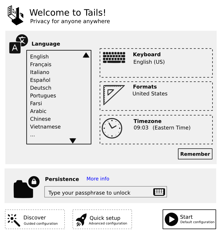
raised in this thread. And I'm thus surprised to see that this was not
taken into account by these designs: all options are displayed upfront
by default.
I think that core problem that we need to solve here is to find the
technical means of doing this: having these options available but not
displayed by default. The two different paths [1] were maybe to right,
the accordion [2] was maybe not realistic, but we also tried views and
tabs [3].
[3]:
https://labs.riseup.net/code/attachments/download/652/greeter2.png
We need to get back to this discussion and find solutions to this
problem that takes into accounts all the arguments that were provided
already and works with the GNOME toolkit.
But once we have this, I'm very confident that we can continue
building up on the more detailed work that you have been doing so far
as it's great and then the final result will be rock solid!
Also keep in mind that **none** of these mockups were tested with
users yet. We talked about them amongst ourselves, we reviewed it with
experts, etc. but we never sat with regular users and watch them
interact with those.
My personal take on this is that we should take it easy, come up with
something that's simple, classic, as little controversial as possible,
and easy to implement. Then test it and see how it does. I would also
be in favor of testing stuff on paper first but I feel like Alan is
dying to type some code; which is great!


%0A>%20%0A>%20Then,%20to%20explain%20a%20bit%20more%20my%20emotional%20state%20when%20dealing%20with%20the%0A>%20Greeter,%20I%20must%20say%20that%20it's%20always%20a%20big%20effort%20to%20jump%20back%20in%20the%0A>%20discussion.%20It's%20quite%20hard%20for%20me%20to%20follow%20this%20by%20email,%20especially%0A>%20with%20big%20delays%20and%20partial%20discussions%20in%20the%20middle.%20I%20also%20feel%0A>%20like%20we're%20working%20on%20quicksands%20and%20we%20still%20not%20agree%20on%20some%0A>%20fundamentals%20ideas%20behind%20this%20work.%0A>%20%0A>%20So%20here%20I%20won't%20comment%20much%20on%20the%20%22implementation%20details%22,%20the%0A>%20layout%20or%20the%20look-and-feel%20of%20the%20drawing,%20but%20on%20more%20abstract%0A>%20concepts%20that%20I%20felt%20we%20badly%20transmitted.%0A>%20%0A>%20My%20main%20concern%20here%20is%20about%20#8976%20%5BConsider%20merging%20%22basic%22%20and%0A>%20%22advanced%22%20screens%5D.%20Let%20me%20recall%20a%20bit%20of%20history.%20Back%20in%20the%20happy%0A>%20days%20of%20the%20last%20design%20that%20was%20consensual%20between%20Alan,%20tchou,%20me,%0A>%20and%20more%20people%20%5B1%5D,%20the%20language%20and%20persistence%20settings%20(let's%0A>%20called%20them%20%22basic%20settings%22)%20were%20the%20same%20for%20everybody%20and%20then%0A>%20people%20needing%20extra%20configuration%20had%20to%20choose%20between%20%22guided%0A>%20configuration%22%20and%20%22advanced%20configuration%22.%0A>%20%0A>%20%0A>%20%0A>%20%0A>%20%5B1%5D:%0A>%20https://tails.boum.org/blueprint/greeter_revamp_UI/greeter-1st-screen.png%0A>%20%0A>%20Some%20months%20later,%20based%20on%20the%20feedback%20from%20the%20UX%20experts%20from%0A>%20NUMA,%20tchou%20proposed%20to%20merge%20both%20the%20%22basic%20settings%22%20and%20the%0A>%20%22advanced%20settings%22%20on%20the%20same%20screen%20with%20accordions%20%5B2%5D%20**while%20not%0A>%20displaying%20them%20by%20default**.%20This%20rose%20some%20controversy%20because%20it%0A>%20used%20widgets%20that%20don't%20exist%20in%20GNOME.%0A>%20%0A>%20%5B2%5D:%0A>%20https://mailman.boum.org/pipermail/tails-ux/attachments/20150114/77c5004c/attachment-0001.svg%0A>%20%0A>%20Shortly%20afterwards%20we%20started%20an%20interesting%20discussion%20to%20try%20to%0A>%20isolate%20the%20problem%20behind%20#8976:%0A>%20%0A>%20https://mailman.boum.org/pipermail/tails-ux/2015-March/000309.html%0A>%20%0A>%20Please%20have%20a%20good%20read%20at%20it%20again%20as%20many%20good%20arguments%20were%20give%0A>%20there%20already.%20Long%20story%20short,%20at%20least%20intrigeri,%20Alan,%20and%20me%0A>%20expressed%20themselves%20again%20displaying%20all%20options%20by%20default%20on%20the%0A>%20first%20screen.%20I%20understand%20that%20tchou's%20position%20is%20similar%20since%20he%0A>%20was%20still%20hiding%20them%20with%20his%20accordion.%0A>%20%0A>%20To%20me,%20no%20strong%20enough%20evidence%20against%20this%20collective%20stand%20was%0A>%20raised%20in%20this%20thread.%20And%20I'm%20thus%20surprised%20to%20see%20that%20this%20was%20not%0A>%20taken%20into%20account%20by%20these%20designs:%20all%20options%20are%20displayed%20upfront%0A>%20by%20default.%0A>%20%0A>%20I%20think%20that%20core%20problem%20that%20we%20need%20to%20solve%20here%20is%20to%20find%20the%0A>%20technical%20means%20of%20doing%20this:%20having%20these%20options%20available%20but%20not%0A>%20displayed%20by%20default.%20The%20two%20different%20paths%20%5B1%5D%20were%20maybe%20to%20right,%0A>%20the%20accordion%20%5B2%5D%20was%20maybe%20not%20realistic,%20but%20we%20also%20tried%20views%20and%0A>%20tabs%20%5B3%5D.%0A>%20%0A>%20%5B3%5D:%20https://labs.riseup.net/code/attachments/download/652/greeter2.png%0A>%20%0A>%20We%20need%20to%20get%20back%20to%20this%20discussion%20and%20find%20solutions%20to%20this%0A>%20problem%20that%20takes%20into%20accounts%20all%20the%20arguments%20that%20were%20provided%0A>%20already%20and%20works%20with%20the%20GNOME%20toolkit.%0A>%20%0A>%20But%20once%20we%20have%20this,%20I'm%20very%20confident%20that%20we%20can%20continue%0A>%20building%20up%20on%20the%20more%20detailed%20work%20that%20you%20have%20been%20doing%20so%20far%0A>%20as%20it's%20great%20and%20then%20the%20final%20result%20will%20be%20rock%20solid!%0A>%20%0A>%20Also%20keep%20in%20mind%20that%20**none**%20of%20these%20mockups%20were%20tested%20with%0A>%20users%20yet.%20We%20talked%20about%20them%20amongst%20ourselves,%20we%20reviewed%20it%20with%0A>%20experts,%20etc.%20but%20we%20never%20sat%20with%20regular%20users%20and%20watch%20them%0A>%20interact%20with%20those.%0A>%20%0A>%20My%20personal%20take%20on%20this%20is%20that%20we%20should%20take%20it%20easy,%20come%20up%20with%0A>%20something%20that's%20simple,%20classic,%20as%20little%20controversial%20as%20possible,%0A>%20and%20easy%20to%20implement.%20Then%20test%20it%20and%20see%20how%20it%20does.%20I%20would%20also%0A>%20be%20in%20favor%20of%20testing%20stuff%20on%20paper%20first%20but%20I%20feel%20like%20Alan%20is%0A>%20dying%20to%20type%20some%20code;%20which%20is%20great!%0A>%20%0A>%20%0A>%20 "Répondre à ce message")